Summary
Yext's review response product was originally designed for SMB users who might want to respond to a few reviews at a time. It was woefully unequipped to deal with volume. I spoke with our customers and worked with product to redesign it into something our enterprise customers could use at scale.
My Role
Senior Product Designer
Timeline
2 weeks research and ideation, 2 weeks for final design iterations
Tools
Figma, User Interviews & Personas
Starting Point
A clunky experience for responding to numerous reviews.
Yext's initial market was small, brick and mortar businesses. When we began offering the ability to respond to reviews on Facebook, Google, Yelp, etc., all from a single platform, there was no expectation that within a few years we'd have Enterprise sized companies trying to respond to 100+ reviews at a time.
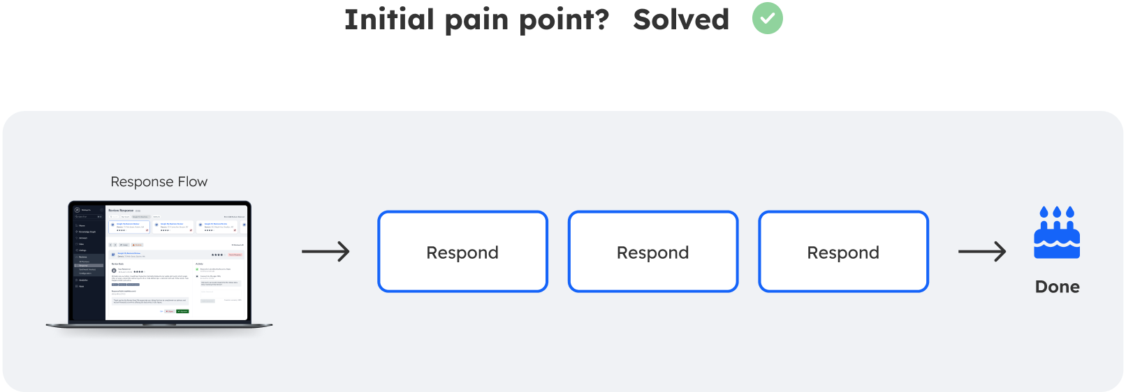
This led to an extremely frustrating workflow, in which review responders would need to sift through a complicated table to find the right reviews, click on each one individually to open a modal and respond, and then close the modal to find the next review. Needless to say, responding to more than just a few could be a maddening experience.
Our enterprise customers were demanding a new approach. I was tasked with finding the solution along with the Reviews PM.

Research & User Personas
Discovering the must haves, needs, and wants.
While the basic issue was clear, we did not want to design or produce anything without understanding the ins and outs of the problem. The Reviews PM and I met with 5 of our largest customers using the review response product to see how much we learn.
Each customer had two different types of users we met with--supervisors, and those actually responding to the reviews. Both had different things they were looking for in the redesign.

Initial Design & Feedback
Conflict between a list of reviews and our left navigation.
I did a series of quick "wireframes", or in this case using components we had off-the-shelf to create a quick high-fidelity design. I then garnered feedback from a variety of sources including PMs, my fellow designers, and our users.
While general sentiment was good, there was some clear issues to clean up. Most important of all was that the component we had wanted to reuse for the list of reviews was conflicting with our new left navigation. We would need to scrap it and build a few new components.